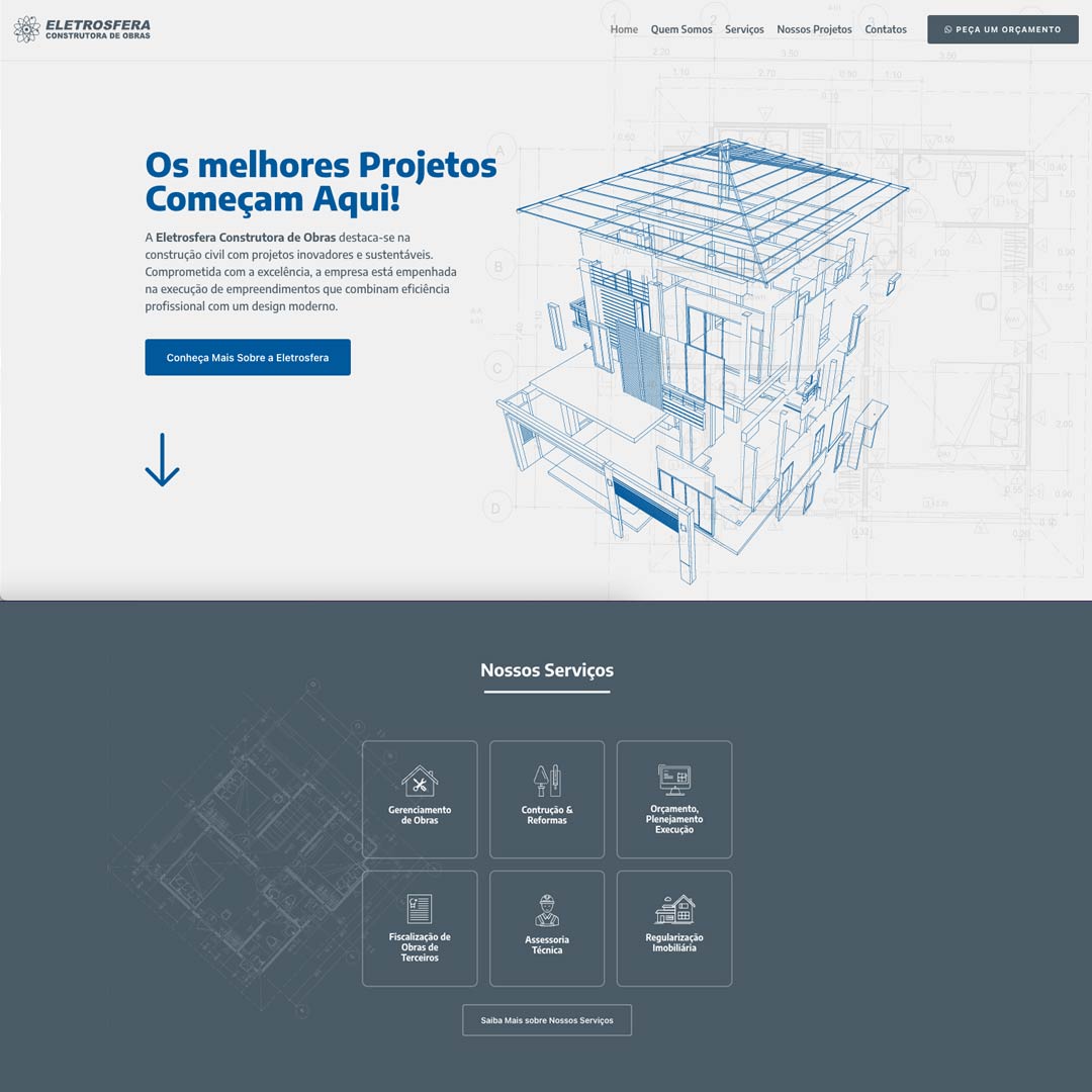
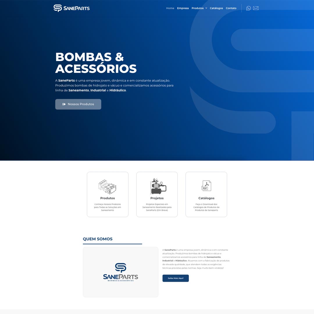
The Eletrosfera website was designed with a minimalist and clean approach, reflecting the essence of the brand and providing an intuitive and pleasant user experience. The design, marked by elegant simplicity, stands out for its clear presentation of information, promoting fluid and efficient navigation. Furthermore, the emphasis on high performance ensures not only an attractive aesthetic, but also an agile and effective response, guaranteeing a dynamic and satisfactory interaction for visitors to the Eletrosfera website.

